Graphic Design: Setting Tone and Mood On Your Site
As the Internet continues to develop and evolve and show us new ways to market, we're continually finding new ways of "embedding" messages into our content. We all live in an incredibly data-dense world, where every product has levels upon levels of messaging within its design. In the best products, these levels of messaging are focused. They are acting in unison to present a single Brand Identify that -in theory- should be instantly recognizable in a context.
Apple is currently one of the best at this. From their website to their stores to their products themselves, a consumer at all familiar with the brand can instantly spot Apple design from a mile away. (Now, if only they'd get over their current Skeuomorphic kick...)
In terms of graphic design, tone and mood are among the most important messages it can convey. The color scheme of your design sets that tone and mood, or at least establishes a foundation, that the rest of your messaging will get built around.
Obviously, this means you need to pick your colors well!
The Color Wheel in Graphic Design: Live it, Love it.
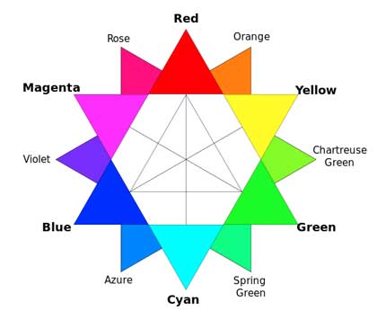
For reference, here is a fine color wheel that should work as a reference.

You can get most of your inspiration from the color wheel itself. You want colors, or collections of colors, that convey a basic idea:
- Monochome: Very simplistic. Either you're using entirely one shade, or else it's a single color plus white or black for the background. Monochrome arrangements can convey elegance and simplicity, such as the black & white design of an Apple Store or Olay cosmetics.
- Complementary colors: Complementary colors are at opposite "points" in the above color wheel. Red and green (cyan), or blue and yellow. These tend to create very bold, eye-catching, but possibly comic book-ish color schemes that grab the eye. Businesses with widespread appeal (such as children plus families) do well with a complementary color scheme.
- Analogous colors: These are colors next to each other on the wheel, such as combining (on the above wheel), Magenta, Violet, and Blue. It creates a similar feel as a monochrome design, but richer. Note, however, that most colors do have psychological effects that we don't have time to discuss here. Using analogous colors will have an additive effect, based on the "center" color, so choose your main color carefully based on how you want to affect the viewer. (The M,V,B combination above would be rather "goth" and a bit melancholy, for example.)
- Triadic colors: Three colors equidistant from each other on the color wheel are triadic, such as, well, the classic Red-Blue-Green combination. These create a very balanced feel, and are good for attracting a wide audience but without the overt "comic book" feel of complementary colors.
Which of these approaches is best for your graphic design? It simply depends on what you're trying to communicate and how you believe your customers will respond to your color choices. Having good buyer personas for your customers can be a big help, as that may give you clues towards their reactions. Focus grouping is another good option, if you have the resources.
Just like set design and lighting "set the stage" for a film or theater production, so your graphic design choices set the tone and mood for your business. Careful consideration of your color options in combination with market-based research, is the best way to find the color combinations that express the "inner you" of your business, just as clothes do for your customers.
Call DeepSky Marketing to find out how you can create profitable marketing strategies for your company. DeepSky Marketing is a company that provides businesses with profitable marketing systems and verifiable return on investment (ROI). To schedule a brief no-cost consultation call 707 823-3888.
MORE RECENT BLOGS
Why Steve Jobs was big on INTUITION
Steve Jobs said: “Have the courage to follow your heart and intuition. They somehow already know what you truly want. Everything else is secondary.” W...
AI is Changing Business. Are You Ready?
In a world where AI is surging, our innate human intuition is becoming more crucial than ever before. An AI class just for you Artificial Intelligence...
How to structure your all-important offer! (in 90 seconds)
Your offer is the entry point into the sales process. A good offer sets up success; a lackluster one doesn’t. Here are best practices: A good offer co...
Is It Time For a Website Redesign?
You'd have to be pretty satisfied with the performance of your website not to occasionally look at it and wonder if it's time to redesign it. After al...
From Vision to Results (read in 30 seconds)
Getting real-world results from the vision in your head and heart is charted in the list below. Vision informs goals. Goals lead to planning. Planning...


